Vantage Vision
A dark, animated Webflow site for a marketing agency in Bulgaria and the Netherlands, built specifically to pitch and win clients.
An agency delivering sharp campaigns but hindered by a website that lacked their actual energy, struggling to stand out in the crowded Dutch market.
Increased inbound leads from Western markets and larger projects landed directly due to the rebuild.
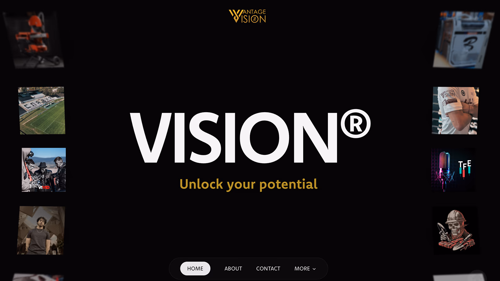
Vantage Vision runs B2C and B2B campaigns across Meta, Google, LinkedIn, and TikTok. Sharp creative, real results, a team punching above its weight. Their own website did not match the energy of their work.
The brief was a Webflow build the team could manage themselves. CMS access, the ability to add new case studies, a system that did not require us in the loop for every update. The structure follows that intent end to end. The design is built around mood. Black throughout, with high-contrast type and photography that leans into the agency's mystique. Premium without saying so. Carefully crafted in Webflow, every section earning its place.
Underneath the visual layer the schema is editor-friendly. Content blocks the team can rearrange. A publishing flow that keeps the design consistent regardless of who is editing which page.
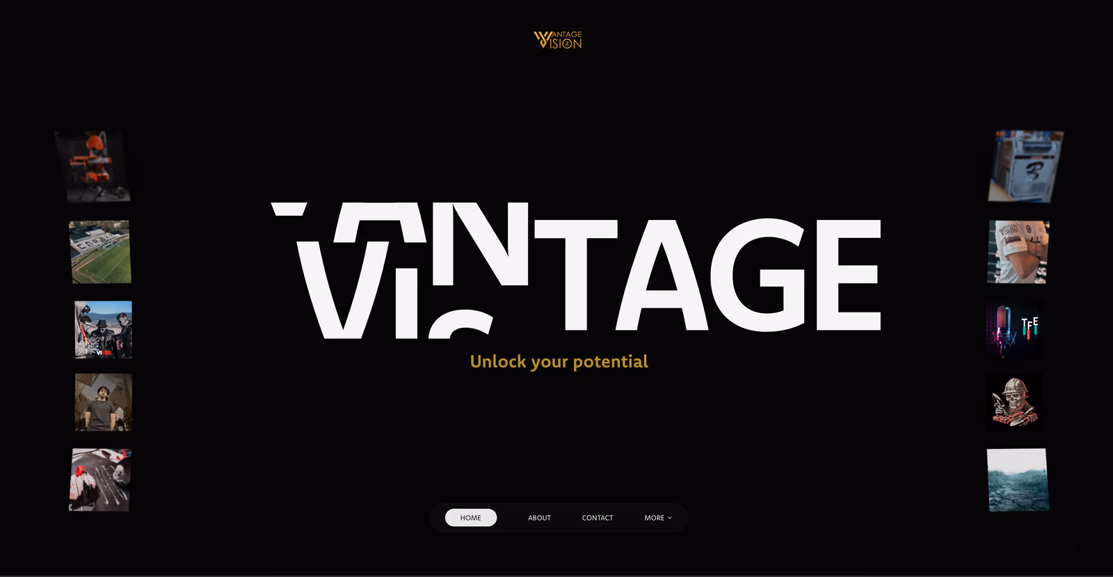
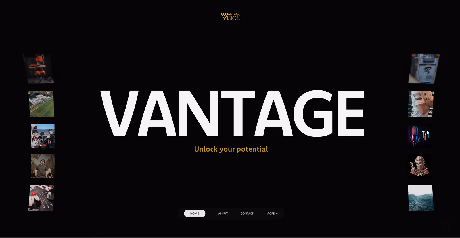
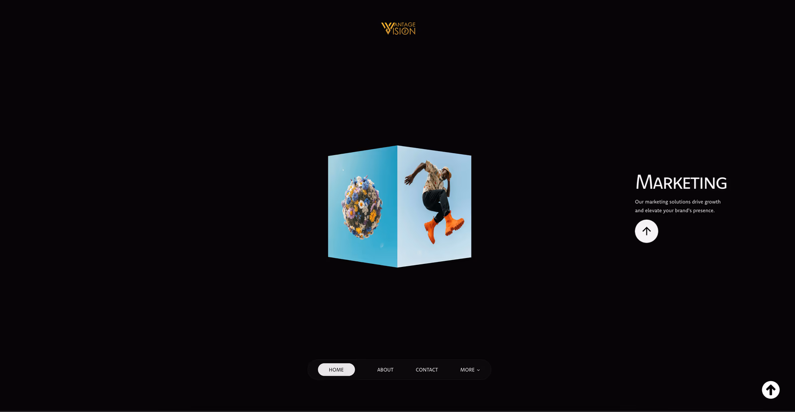
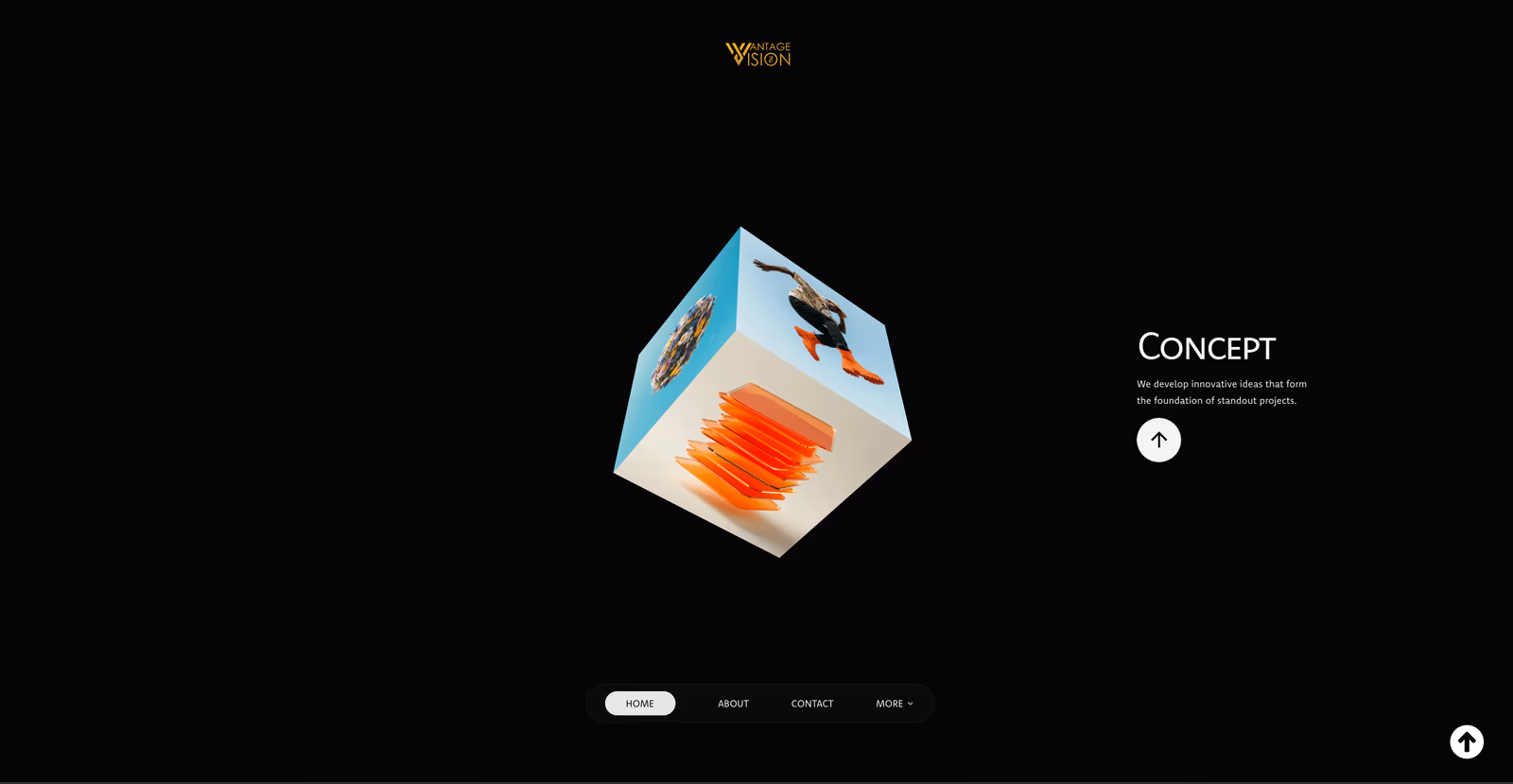
The animation work is where the site does most of its selling. Custom Three.js sequences and GSAP timelines that earn their place by drawing attention to specific decision points. Nothing decorative, nothing for its own sake. Each effect ties to a moment in the visitor's journey.
The site is now the agency's primary pitch tool. They show it on calls. They link it from cold outreach. They let the visuals do the early work before a single conversation begins. It has helped them land bigger clients on the back of it, particularly in the Dutch market, where the field is more crowded than in Bulgaria. Several closes have happened where prospects told the team directly that the website was the reason they signed.
Inbound has grown beyond the home market. The United States and the United Kingdom now find Vantage through the site. Briefs come in larger and better paid, and the win rate has shifted with them.
The hardest design problem was simply standing out. Marketing is one of the most crowded spaces online and most agency sites blur into one another. The dark aesthetic, the animation work, and the stripped navigation do that work. The site looks expensive on first contact and holds attention long enough to make the case. We continue to update it month to month as the agency expands into new markets, with new case studies, new campaign pages, and steady performance tweaks.