
Case studies.

What we built, what it changed, and how long they stayed.

spqr shop

A bespoke jewelry brand we've run since 2020: two redesigns, a platform migration that doubled sales, and the daily operation behind it.

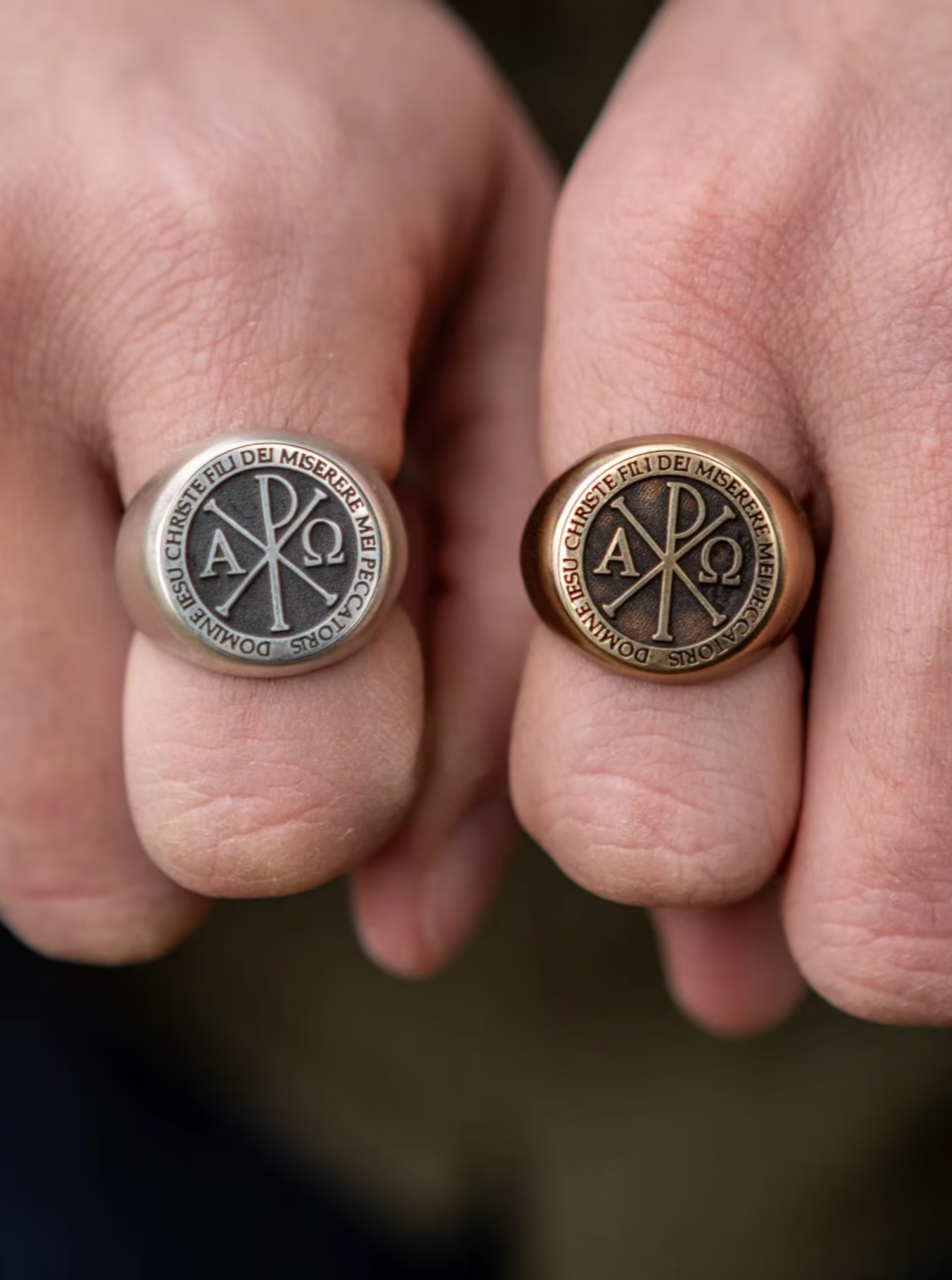
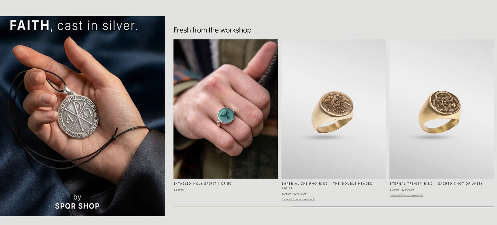
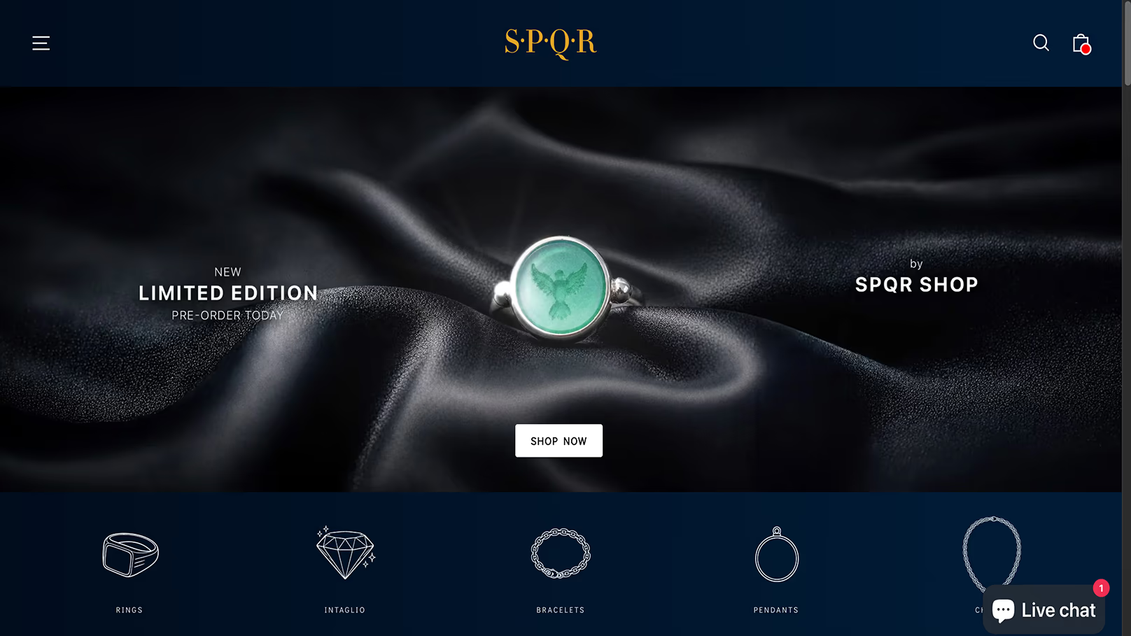
SPQR Shop is one of our longest-running partnerships. We launched the first store with them in 2020 and have run the storefront, the brand, and most of the operation around it ever since: bespoke jewelry rooted in Roman history and Christian tradition, made by a small atelier for a niche audience mostly in the United States.

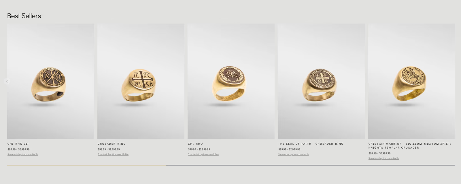
The original store ran on WordPress and WooCommerce. By 2023 the catalog had grown to roughly two thousand products and page speed had collapsed. We trimmed it to the strongest sellers and migrated the whole shop to Shopify that same year. Sales doubled.

The 2026 redesign is the current site. A persistent add-to-cart bar lets a customer pick a stone, an engraving, and a metal without ever losing the item they're buying. The visual reference is Apple: calm, dark, generous spacing, a long single column built for slow browsing. We treat it like a workshop, not a one-time project.

shopifyplatform
USmarket
6 yrspartnership
visit site
SPQR Shop: bespoke jewelry storefront on Shopify

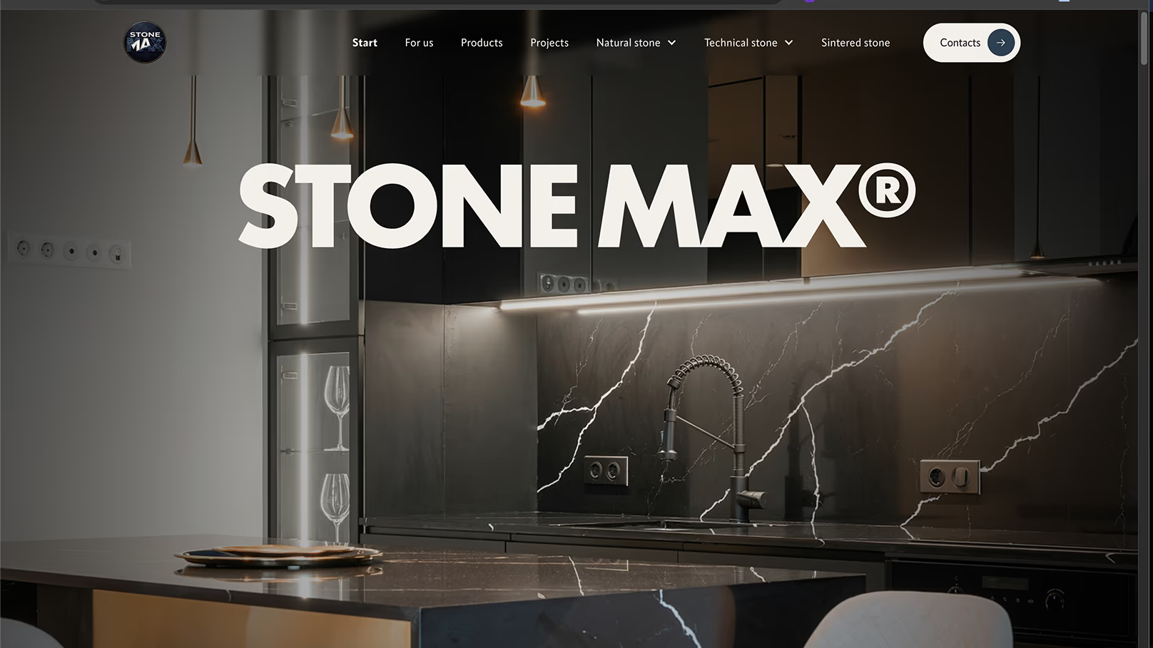
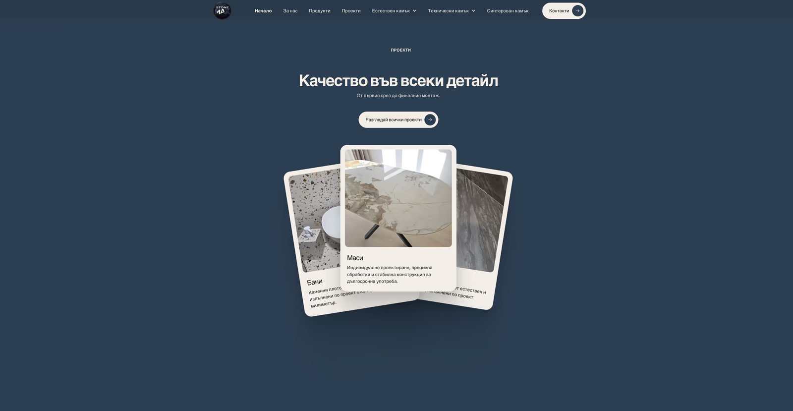
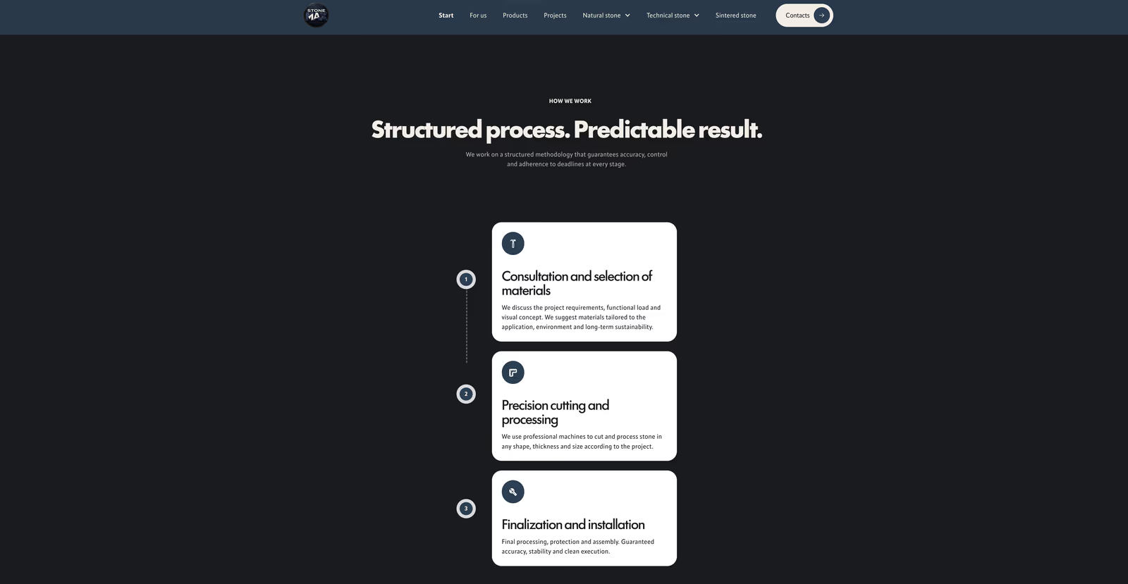
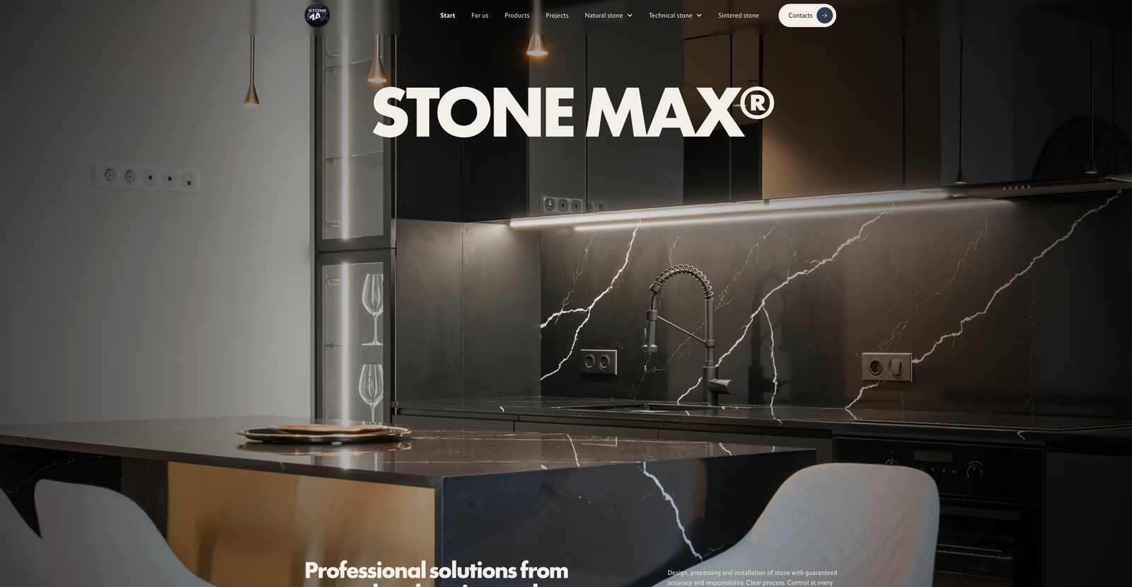
stonemax

The work was always exceptional; the old site hid it. A rebuild for a master stone-surface builder, with a materials catalog and a CMS the owner runs himself.

StoneMax came to us for a redesign. They build bespoke stone kitchen surfaces in Bulgaria, locally known as кухненски плотове. The work was always exceptional; the old site just hid it and lost prospects instantly.

We built the new site in Webflow with a custom CMS the owner runs himself, plus a real-time materials catalog clients can browse. The brand is no longer hiding behind its own URL: it leads with it, and the new portfolio is something the owner proudly shares.

webflowplatform
real-timecatalog
owner-runself-serve
StoneMax: Webflow site for a bespoke stone surface builder

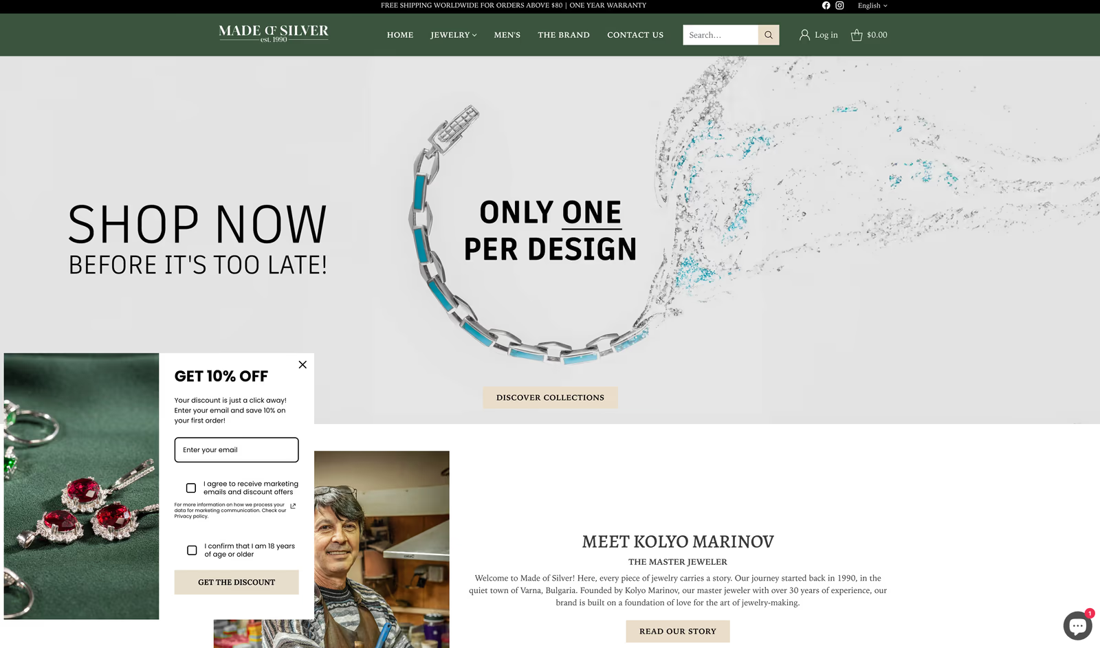
made of silver

A Shopify store for a jeweler making one-of-a-kind pieces, built to sell the craft, not just show it.

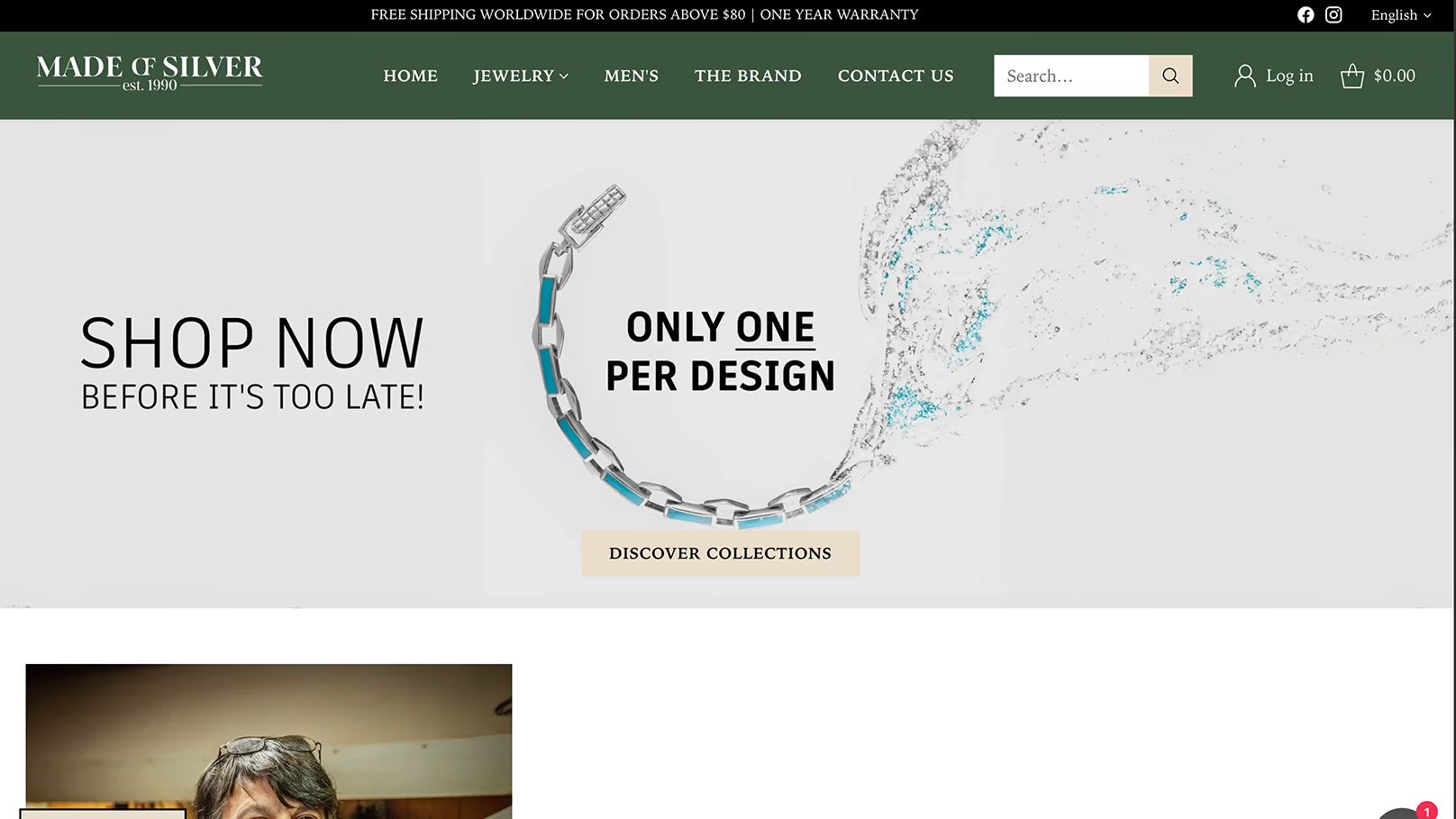
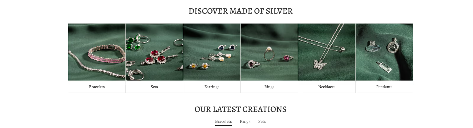
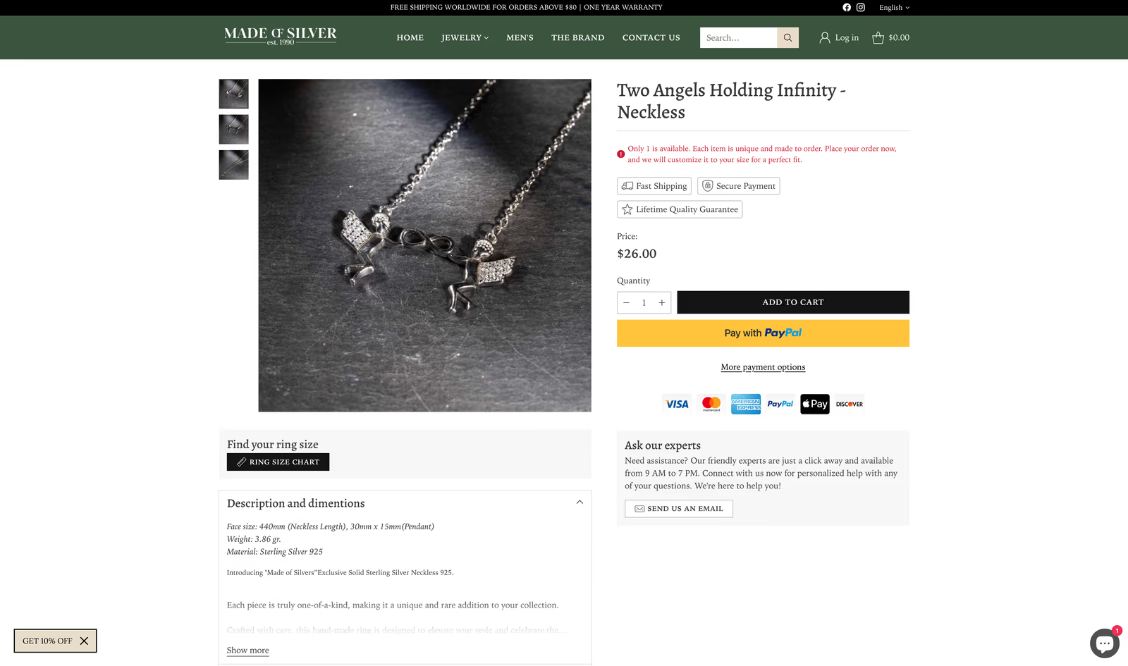
Made of Silver makes rings, pendants, and finer pieces for women, most of it one of a kind. The previous storefront failed to reflect the premium price and craft of the work. We rebuilt it on Shopify with intention: a green palette chosen specifically for the brand, generous whitespace, large product photography, and quiet typography that lets the work speak.

The store sells primarily into Europe: mid-budget pricing, very high product quality, very intentional design. Email runs through Omnisend: welcome flows for new buyers, abandonment recovery, and slow campaigns to the existing list when a new collection lands, with customer behaviour feeding the product recommendations. We run the store with them while the team focuses on making.

shopifyplatform
europemarket
4 yrspartnership
visit site
Made of Silver: Shopify store for a fine jewelry studio

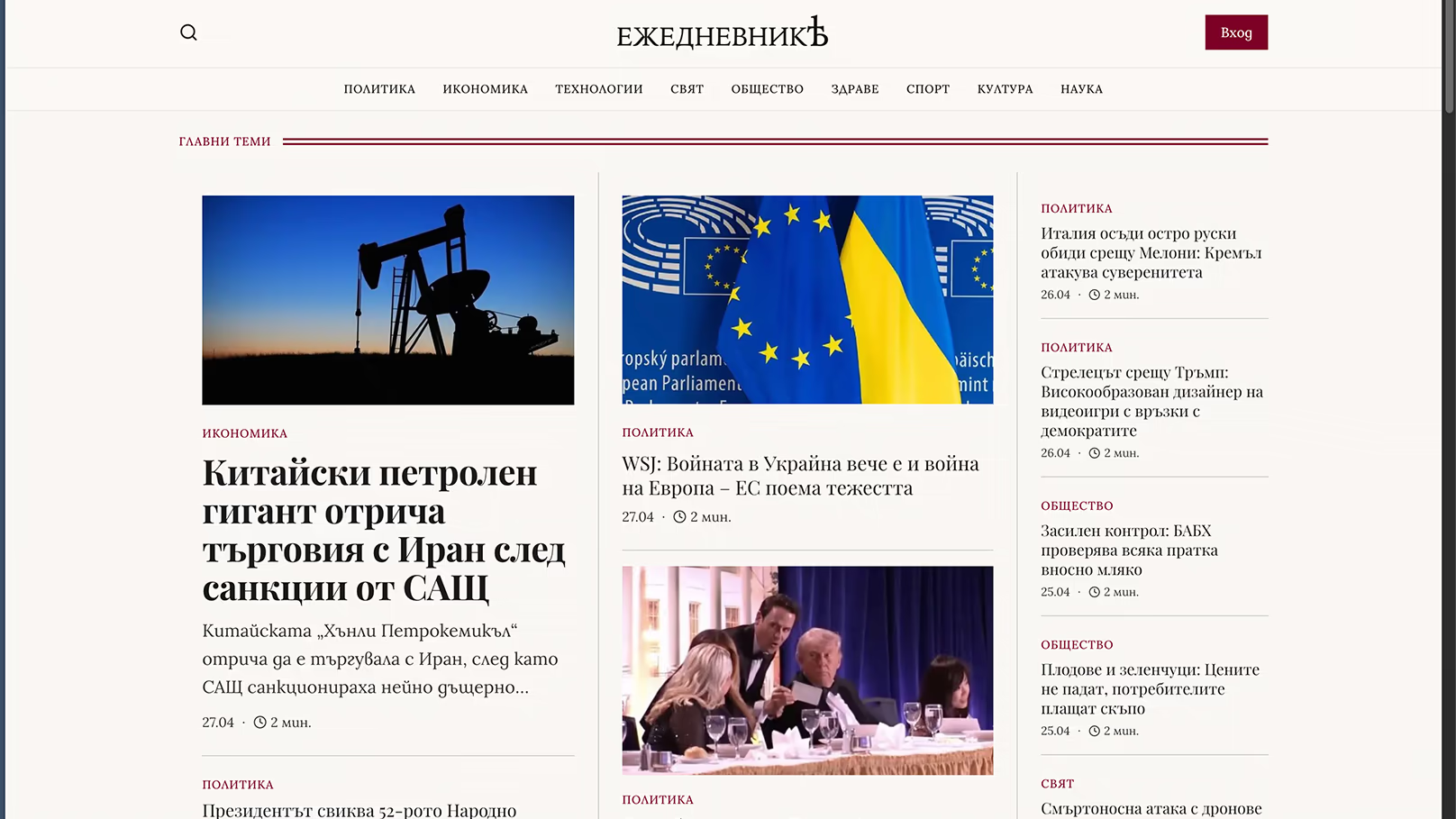
ezhednevnik

A custom news platform for a Bulgarian media company: a fast frontend, a CMS one editor runs alone, and an automated AI drafting pipeline.

Ezhednevnik is one of the most complex builds we've shipped. The brief was to replace a slow WordPress publication with a real product: a custom application, a headless CMS the editor can run alone, and an automated pipeline that turns approved sources into draft articles in minutes. The reading experience borrows from traditional media, a three-column layout close in spirit to the Financial Times and the New York Times.

A database holds every article, image, tag, and category, and the automation pipeline turns the editor's approved sources into finished drafts in minutes, with image generation running alongside. Around the core sit smaller integrations for alerts, approvals, and syndication. This is one of the projects we're proudest of: a real product, not a marketing site.

minutessource to draft
1 editorruns the cms
wordpressretired
Ezhednevnik: custom news platform

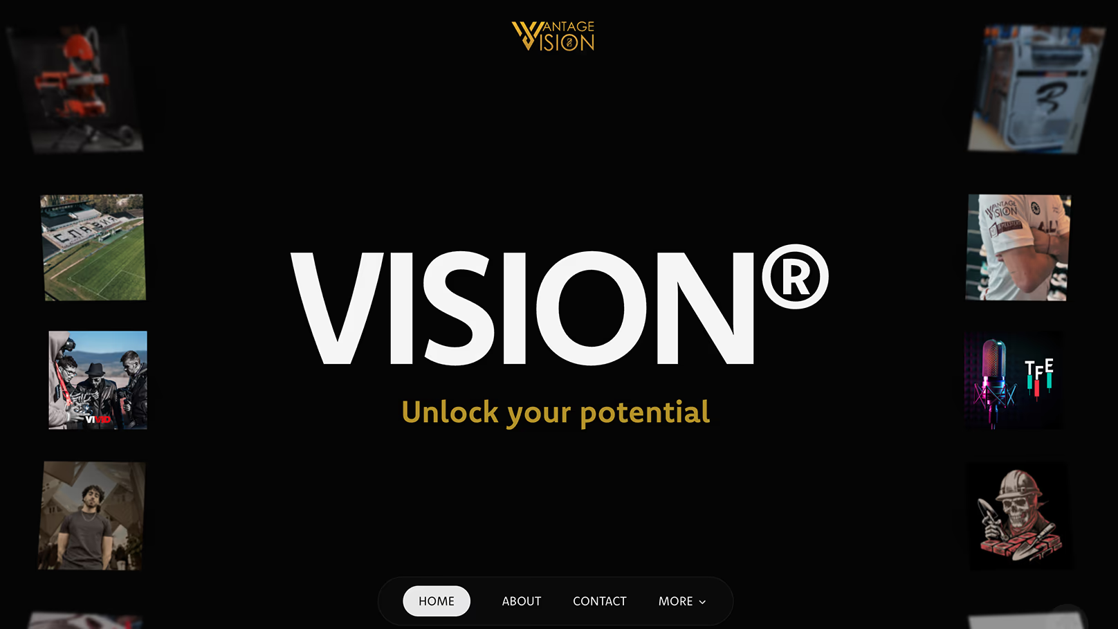
vantage vision

A dark, animated Webflow site built to pitch and win clients. Prospects have told the team the website is why they signed.

Vantage Vision runs B2C and B2B campaigns across Meta, Google, LinkedIn, and TikTok, but their old site lacked the agency's energy in a crowded Dutch market. The brief was a Webflow build the team could manage themselves. The design is built around mood: black throughout, with high-contrast type and photography that leans into the agency's mystique.

The animation work is where the site does most of its selling: custom Three.js sequences and GSAP timelines. It's now the agency's primary pitch tool, and several closes have happened where prospects told the team directly that the website was the reason they signed. Inbound has grown beyond the home market, with the United States and the United Kingdom now finding Vantage through the site. We continue to update it month to month.

webflowplatform
three.jscustom animations
us + ukreach
visit site
Vantage Vision: dark, animated Webflow site for a marketing agency

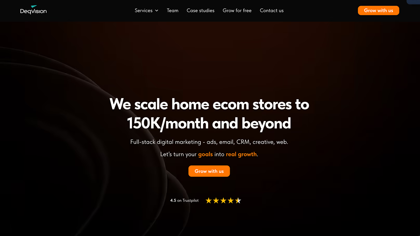
deq vision

A pixel-perfect Webflow build for a Bulgaria- and London-based agency: Figma to live in two weeks.

Deq Vision is a marketing agency split between Bulgaria and London. Their old structure looked unprofessional and cost them real clients in the first few seconds of a visit. They came to us with a sharp Figma file and a deadline. We followed it to a tee and translated the entire design into Webflow, pixel for pixel.

The site shipped in roughly two weeks and now sits comfortably alongside agency websites in Western markets: a reliable base for paid traffic that the team manages itself through a custom CMS.

~2 wkfigma to live
bg + ukmarkets
selfcms
visit site
Deq Vision: pixel-perfect Webflow build for a marketing agency

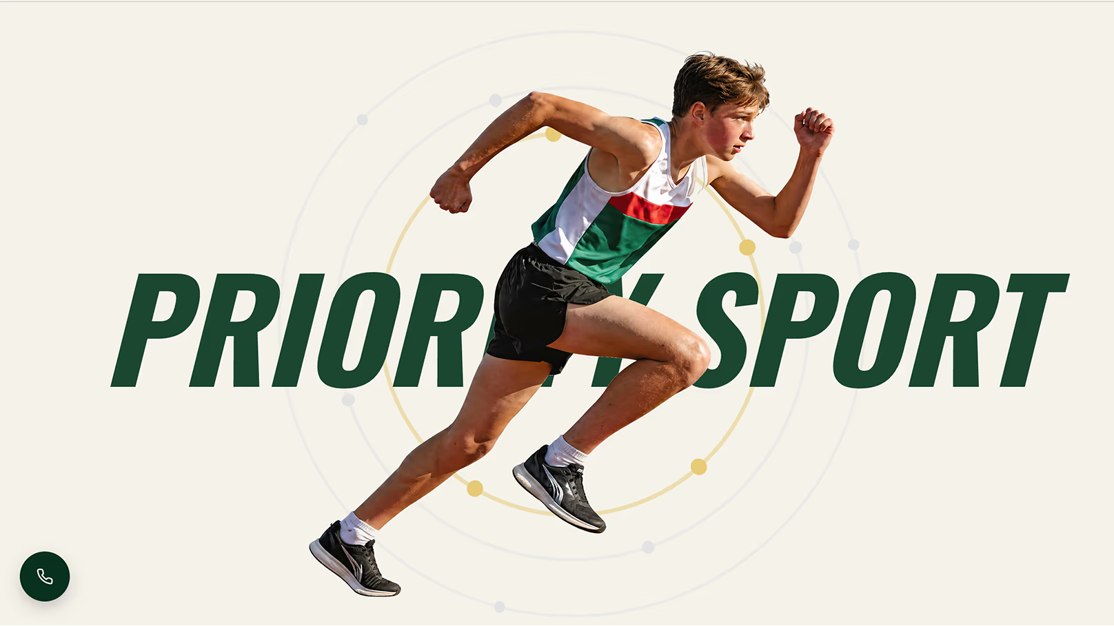
priority sport

Broken registration was costing a sports brand enrollments at the national stadium. We rebuilt it, run the ads, and hold cost per lead well below industry.

Priority Sport runs daily training at the Vasil Levski National Stadium, summer and spring camps, and the Go Kids athletics league. The brand is led by Maggie Hristova, a multi-discipline national champion in Bulgaria. The previous site was a slow WordPress build whose registration forms had broken to the point where parents were downloading PDFs to enrol their kids in races.

We rebuilt it with working registration and live schedules the team runs itself, and we run the paid acquisition too: targeted Google Ads, careful keyword work, and a cost per lead well below industry. All assets are custom: no AI imagery, every photograph licensed and shot in the field. We host and maintain it, and we've been working with Maggie for around two years.

2 yrspartnership
dailytraining
liveschedules
Priority Sport: training, camps and a kids athletics league

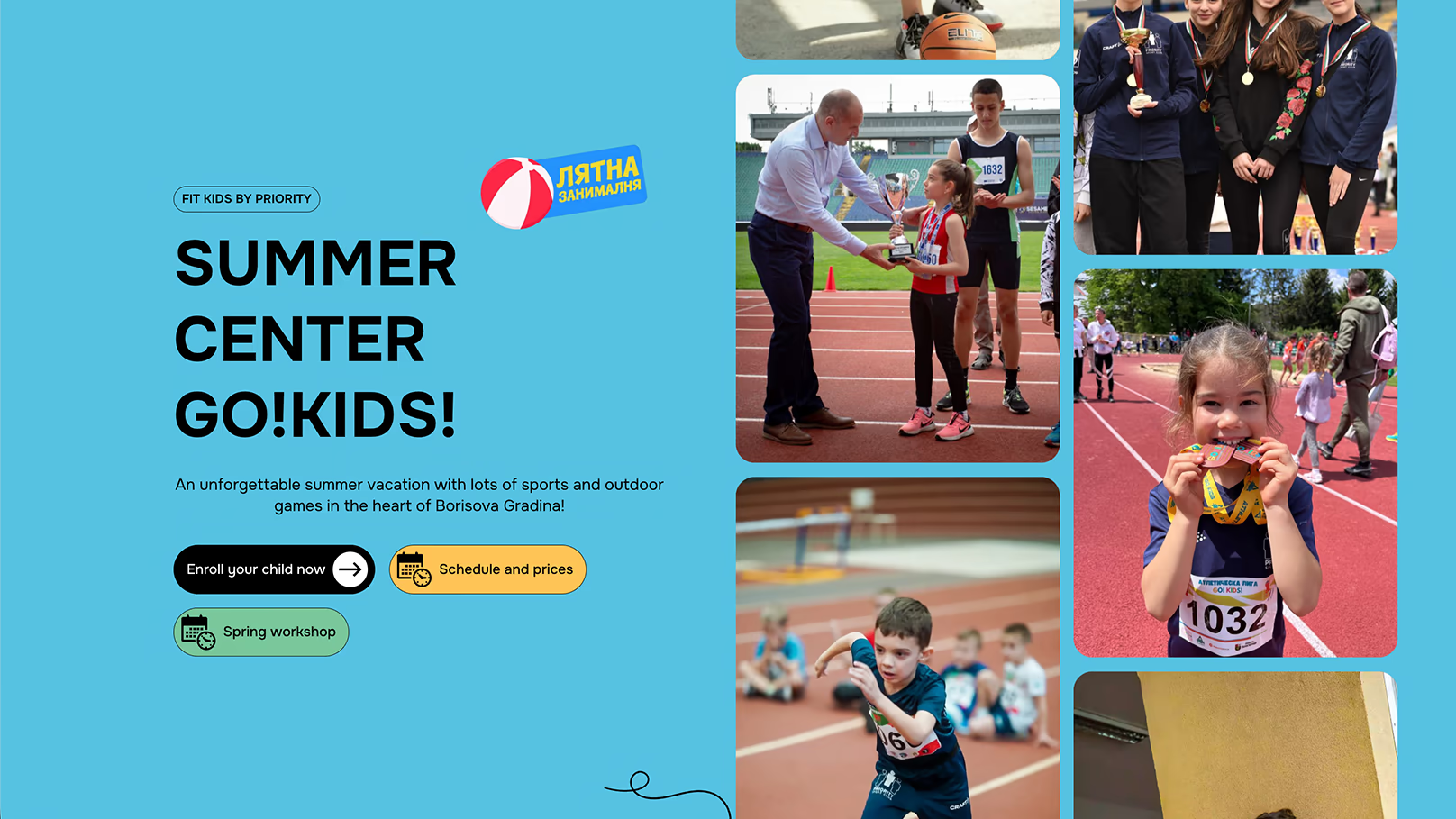
fit kids

A focused landing page for a kids camp and nanny service, built to turn ad clicks into bookings.

Fit Kids is a separate site we built for Maggie alongside Priority Sport. The camp was growing but had no online enrollment path, leaving parents without a quick way to book. The answer was a one-page Webflow build, designed in-house, with a submission form at the centre of the page.

We run Google Ads to it during the seasons that matter, summer and spring, and Maggie has been running ads to it since launch in 2025: a high-converting page backed by steady traffic and strong seasonal sign-up rates.

webflowbuild
google adsacquisition
2025live since
visit site

Working with the team at Nine Taps was effortless from start to finish. The site looks professional, works flawlessly, and parents love how easy it is to navigate. I could not recommend Nine Taps more highly.

Magi Hristova · Owner, Fit Kids
Fit Kids: high-converting landing page for a kids camp

the kaiser

A short-film site for a story about Schumacher and Senna, rebuilt from zero in days after a hack, in time for the trailer launch.

The Kaiser is a thirty-minute short film about Schumacher's first race and his early relationship with Senna. We built the project's website for Lubo, one of our longest-running collaborators. Then the database was hacked beyond recovery and we had to start again, fast, just days before the trailer launch.

We rebuilt from scratch with a clear visual reference: Netflix. Auto-playing trailer-style video on the home page, a monochrome aesthetic with carefully placed colour, and one job: generate donations. After the trailer announcement the site needed to absorb 500 to 1,000 concurrent visitors at peak. The stack held. Thousands of dollars have been raised through the site, and big sponsor names have come on board behind the work.

500–1kpeak traffic
$1,000sraised
30 minruntime
The Kaiser: short film site built for a trailer launch and funding

Your work is exceptional. Let's build the site that shows it.

Give us 30 minutes and we'll show you exactly why your current site isn't working. Free, and you keep the findings.

whatsapp us+359 885 771 116 call us+359 885 771 116
our work book a discovery call